Let’s talk about the gotchas
We live in a WYSIWYG (what you see is what you get) world. Your expectation is that the beautiful postcard you’ve designed on your laptop will look exactly the same when it’s printed and mailed to your clients. Unfortunately, print isn’t completely WYSIWYG. Designing for print has become a lot easier with all of the advances in technology, but there are still a few things that you should know to make sure your projects look exactly the way you expect.
Here are a few considerations for print design:
Spot Color and Process Color
 The color you see with your eyes comes from a spectrum of reflected light. It’s pretty amazing the way it works. When you see white, your eyes are actually picking up the entire spectrum of light. An object that appears black reflects none of the spectrum. Every other color you see is somewhere in between – the object you call red only reflects combination of light waves that we identify with that name.
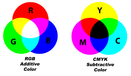
On your computer screen, color is produced by the emission of red, green, and blue (RGB) dots or pixels. The color that’s captured by a camera works the same way in reverse. The technical name for this process is additive color. Print works a different way, and that’s where some problems can arise.
The color that you see on a piece of paper can be produced a couple of different ways:
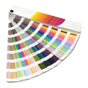
- Spot colors (named colors) are created with colored ink. Printers’ inks use pigments that reflect very precise spectra. Pantone colors or PMS colors define the colors by number. You can actually choose a specific color from a Pantone swatch book that defines it with a number. Typically, brand and logo colors will be specified as spot colors to assure a uniform appearance in print.
- Process color (or CMYK color) determines the reflection of color in a different way. It’s a combination of four basic inks – cyan, magenta, yellow, and black (CMYK). All of the colors combined produce black. Removing percentages of the four colors produces a combination of inks that reflects the colors we identify in the spectrum. That’s why the CMYK color model is called subtractive color.
Today’s digital printing devices operate using CMYK colors, and that’s where the potential problems happen. The translation from additive color on a computer screen to the subtractive CMYK color model really isn’t WYSIWYG. What you see on your screen will be similar to what’s printed, but the colors can shift when they’re translated to print.
 The good news is that there are ways to compensate. Professional print design software like Adobe InDesign, Photoshop, and Illustrator allow you to create in CMYK mode. Other photo editing software will let you convert from RGB to CMYK. Print layouts created in other software platforms (Microsoft Word, for example) can be saved as a .pdf file that can be converted to CMYK.
The digital presses in use at Thomas Press are really very good at producing accurate color, even when there may be some difficulties with the digital files. Pantone colors can be defined to match your branding and we’ll do our best to make sure the printed output matches the appearance of your files on screen. Printers call this pleasing color, and it’s usually very close. If it’s necessary to convert or modify your files, we’ll send you a .pdf proof on request; but because color can change from monitor to monitor, it’s always best to request a hard copy proof to examine final colors.
Here are some tips to assure color accuracy:
- Design in CMYK mode whenever possible.
- Convert all photography to CMYK.
- Save your files as a print quality .pdf in CMYK mode (if possible).
- Request a hard copy proof to check final colors.
- Use PMS colors for logos and branding, and make sure to let us know if there is a critical color used in your project.
Take a look at our File Specifications and Recommendations page to learn more about preparing digital files for print.
So Many Fonts to Choose from

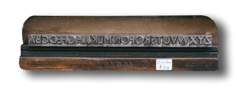
Old School Typesetting. Nope, it’s not backwards.
In the old days, printers offered a selection of fonts that their customers could choose for their projects. Typesetting was done at the printing company using the selected typeface, but there really weren’t that many to choose from. Desktop publishing changed all of that and today there are literally hundreds of thousands of fonts, many available absolutely free on the internet.
That’s where the difficulty comes in – it’s impossible to have all of the fonts. What’s on your computer might not be on ours, and some file formats will simply substitute a common font when the original isn’t available. This can drastically change the look and the flow of a print document. Microsoft Word and other word processing platforms are notorious among printers for the problems they cause.
Page layout programs like Adobe InDesign will allow you to include fonts in a packaged file to be sent to a print provider. It’s also possible to embed fonts when a file is converted to the .pdf format, but this option may not be set by default on every software application you use and font problems can still occur with .pdf files.
Here are a few tips to minimize font substitution problems:
- Save or convert your file to a print quality .pdf with fonts embedded.
- If you can’t specify .pdf file formats, check the file on a couple of computers to see if fonts change.
- Send special font files (usually .ttf or .otf) separately with your project files.
Take a look at our File Specifications and Recommendations page to learn more about preparing digital files for print.
Photo and Image Resolution
In the not too distant past, full color printing was beyond the budget of most companies. Printing in color was a complicated process that required expensive equipment, and even including a color photograph in a brochure could more than double the cost of a print project.
![]() That’s certainly not the case today. Digital color printing is very economical and you’ll want to use colorful photography and graphics in the projects you send to Thomas Press. There are two classes of images that can be used in your print files – bitmap and vector. The chances are good that you’ll use both types of image, and there are a few things to know about each type.
That’s certainly not the case today. Digital color printing is very economical and you’ll want to use colorful photography and graphics in the projects you send to Thomas Press. There are two classes of images that can be used in your print files – bitmap and vector. The chances are good that you’ll use both types of image, and there are a few things to know about each type.
Bitmap (or raster) images include the familiar .jpg file format and several others (.tif, .png, .gif, and more). All of the photos that you take with a digital camera, download online, or scan will be bitmap images. Bitmaps are comprised of pixels (dots), densely packed together so they appear to be solids and shades when they are printed or displayed on a computer screen.
There are a couple of important difference between the images you see on your computer screen and those that are suitable for print. The biggest difference is size. For print, bigger is usually better. In simple terms, bigger means more dots. On a computer screen, an image will appear clear at 72 dots per inch (dpi). The dots must be compressed more closely together for a print image – 300 dpi is recommended at the final size. Small photography and images pulled from a Google image search are likely to appear grainy when printed. Photos from most smartphones will work fine for print, but they may not be large enough to cover an entire page.
The second image format is a vector image. Vectors work very well for all kinds of print. Vector images define shapes and fills and they can usually be resized to any dimension. Most logos and illustrations will be originally created as vectors, and Pantone colors can be included. For print, vectors should be submitted with either CMYK colors or Pantone colors defined in the image. The most common file types are .ai, .eps, and .svg
Tips for photos and images:
- Bitmap images should be converted to cmyk color mode or greyscale for Black and white images.
- Recommended resolution for bitmaps is 300 dpi at final (printed) size. Downloaded images may appear grainy or blurred when printed.
- Vector images should be created in CMYK color mode. Spot/PMS colors may also be defined in the image.
- Images should be scanned at 300 dpi or higher resolution if enlargement is required. Scans can be saved in .jpg or .tif format and should be converted to CMYK color for print.
Take a look at our File Specifications and Recommendations page to learn more about preparing digital files for print.
Isn’t there an easier way?
Yes, absolutely there is. Thomas Press will help you in any way we can. We can help you convert your files and photos for print and identify any problems that might occur. If you’re uncomfortable with the technical aspects, don’t hesitate to get in touch.

